Art in Public Places

I’m currently in the thick of installing work for the Hobsons Bay City Council initiative, Art in Public Places.

Three sites and I have two days left(!).

The first site, is at Mason St Newport.  And outdoor site, brick wall and asphalt footpath.  Once the previous artwork was removed from the wall, it revealed what I had to work with; a painted brick wall, with some damage.  I painted it a pale grey all over for the base coat.

Working outdoors has presented some challenges I’m not used to.  For starters, it gets dark of an evening – earlier and earlier now that we are headed to shorter days.  So I have needed to work around  my other commitments and daylight.  But not only that, the weather has been hits and misses since the weekend, with intermittent showers.

Read More

2013 At Great Speed

At great speed, 2013 is hurtling along already.  Dramatic, isn’t it?

I have a few projects starting to take shape, and it’s a pretty exciting time.  I can see some of my work behind the scenes start to bring forward opportunities.  That’s always comforting – at times I can get such tunnel vision for those behind the scenes tasks and wonder if I’m just obsessing for no solid outcomes.

In 2013, I will be doing an Honours year at a different and highly respected art school in Melbourne.  So excited to get back to study and pulling apart my practice.  I have come a long way from when I first found out in November.  I have progressed through feelings of uncertainty, nerves – now I’m pumped, and ready to go.  Roll on end-of-Feb.

Read More
Entry Point Plus Construction (c) 2012 Naomi Nicholls

Graduate Exhibition

After all the hard slog preparing, the Graduate Exhibition was a great success.  We had a great opening night, standing room only in many areas of the buildings.  Approx. 750 people responded with an RSVP and that seems about right.  We also had a great many through during the rest of the exhibition.

Thanks to my fellow artists, RMIT staff and all who contributed and made it a great opening and great exhibition.  And thanks to friends and family for coming to see the show.

Read More

Getting Ready for RMIT Graduate Show

A quick catch up post about preparing for my Graduate Exhibition.

It was an incredibly enhausting time. We emptied our studios of all furniture, painted endless walls and floors and began setting out work across many rooms and booths. There were lots of challenges to hang a cohesive show, combining the work of over 50 artists into the one show was an incredible undertaking and not without it’s stressors. I was alotted a space to install my work quite late, which was a huge challenge for me. Normally I have days to prepare, to sketch and do colour experiements, but I almost had to enter the space dry. I found this so hard.

Read More

Blue Cubed

This work was born out of a series of drawings and paintings on paper and I wanted to see them in large scale.  Often when working on paper or sketching, the works don’t feel complete until I can walk into them at large scale.  So I was keen to get this one on a wall.

Read More

Structure into Pink and Blue is complete

Installations are hard to photograph.  I always find it tough.  Straight lines warp through the camera, light is hard to capture (for the novice photographer), and you can’t shoot around corners or capture two elements of the installation that talk to each other in the same frame.  I usually find solace in the fact that I take as many photos as I can from as many angles as I can, trying to focus on the sweet spots for reading the installation, or at least where I think the sweet spots are.  It was suggested to me a while ago to start filming my installations, as a way of capturing the spatial experience of moving through the work.  It’s not perfect, but it’s definitely something.  I have been doing this on and off for a while.
Read More

Upscaling Didn’t Quite Work

Sometimes things just don’t work.  Many times I have painting things in small scale and then tried them on a large scale and it just flopped.  That happened again recently.

It was the first time I attempted those random and deliberate brush marks in a large scale.  I had plans of linking the shape together and unfolding an installation across the room, in a similar way to these works on plywood, but the upscaling did nothing for the shape.  To me it just looked like the beginnings of a graffiti mural, which is not the content I want to bring to my work at this point (if ever).  As with before, it seems the problem was the size of my brush in relation to the size of the shape.  It may have worked if the shape had been half the size.  Or if it was filled in, which I have since started to do.

Painting Experiment 3 (Yellow, Blue, Red)

(c) 2012 Naomi Nicholls, Painting Experiment 3 (Yellow, Blue, Red)
Video still

This still is from my latest painting experiment, this time with red, yellow and blue.  Are you seeing a theme with primary colours recently?

This is the most successful yet.  I was able to get the lighting right, a good camera and edit properly.  I’m learning a lot about the video process.  However, as you learn more about making video, you find there is so much more to know.  I enjoy making videos, but for the moment, that’s not where I want my focus to go.  So, they might just appear in my work now and then.

This work will form part of my assessment this semester and may turn up in some exhibitions in the future.

Tweaking Primary Colours – works on plywood

(c) 2012, Naomi Nicholls
Acrylic and acrlyic paint pen on board
 (c) 2012, Naomi Nicholls
Acrylic and graphite on board
 (c) 2012, Naomi Nicholls
Acrylic and graphite on board
 (c) 2012, Naomi Nicholls
Acrylic and graphite on board
(c) 2012, Naomi Nicholls
Acrylic and acrylic paint pen on board

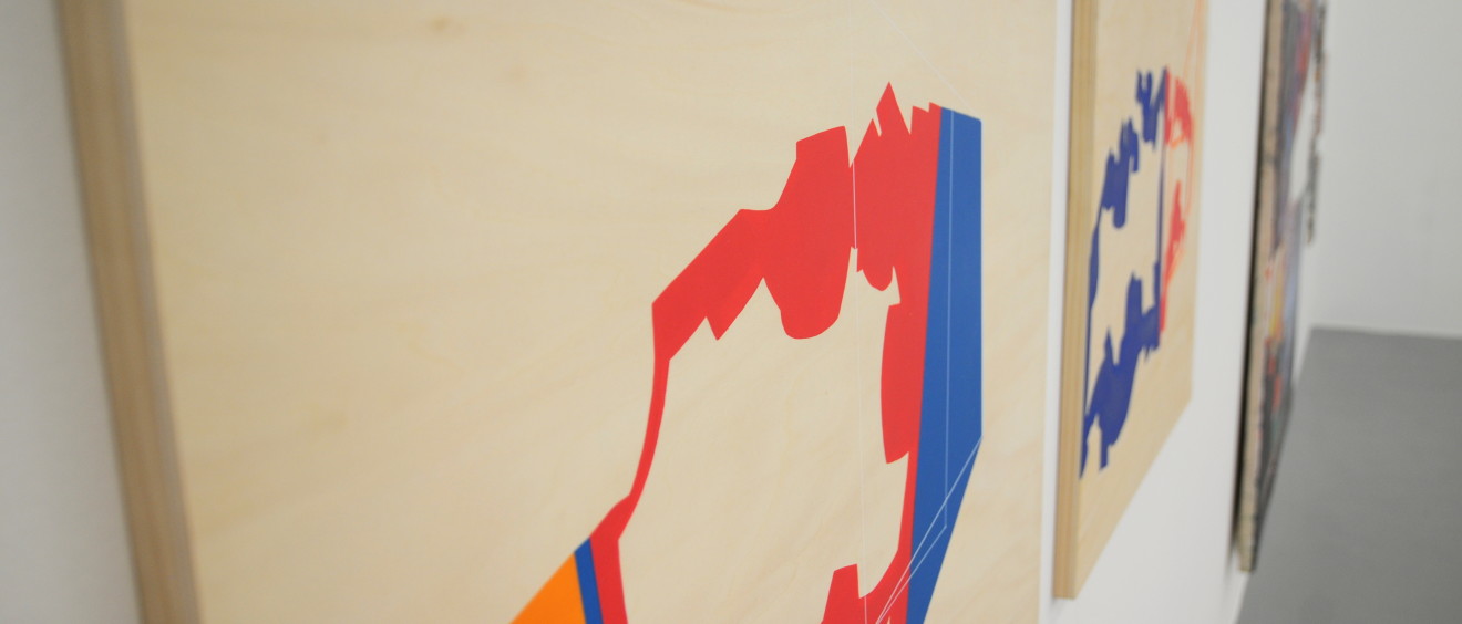
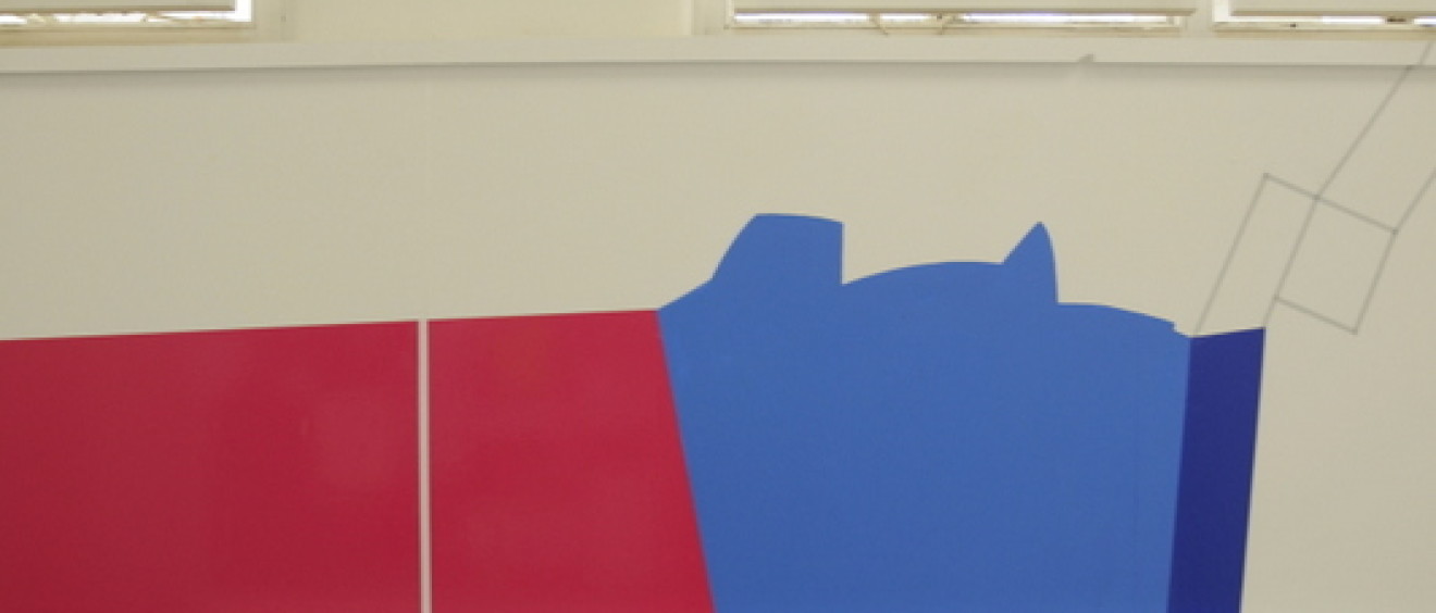
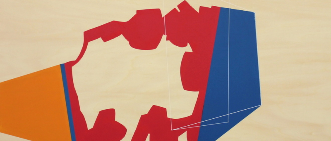
Here are some more works on plywood board.  It’s a wonderful material to work into, as it comes complete with a spatial or atmospheric kind of ‘background’, because of the wood grain surface.

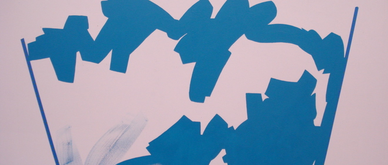
I’m focusing on primary colours with my colour choices.  I think in terms of starting with red, yellow, blue and tweak them slightly.  The blue may become a light blue or royal blue.  The red I turn slightly to a hot pink or magenta by adding the tiniest bit of white or yellow, or go all the way to a fleshy tone.  The yellow I turn, either slightly or a long way, in the direction of orange.  There’s also some random green in one of these works, thrown in for good measure but unrelated to primary colours.  However, I must say, I think that work is the least successful in terms of colour palette.

I’m finding these adjustments are a great way to deal with colour.  The relationships between the colours are still largely based on primaries, but it alters my thinking about them and my fear of primary colours, inspired by art history’s fear.  While not quite ‘complementary’ colours, they still operate in a really illusory way.  Complementary colours naturally work amazingly to create optical illusions, because they are truly opposite colours.  These tweaked primaries have something at play also and I am deep in sorting it out as I go along.

Green Reach (c) 2012 Naomi Nicholls

Green Reach

This work has its origins in those random and deliberate brush mark developments.  I love those shapes.  The following relates in particular to the ones in the lower half of that earlier post.

Wanting to put some reference to my body in the work, I worked out a way to use my reach.  I planted my feet in a spot close to the wall, near the corner and used one hand only to paint.  I began to build the shape with the aforementioned random brush marks, but only what I could reach with feet planted.  The arc of my arm meant the shape took a circular structure.

(c) 2012 Naomi Nicholls, Green Reach
Acrylic paint on wall (installation view)
 (c) 2012 Naomi Nicholls, Green Reach
Acrylic paint on wall (installation view)
 (c) 2012 Naomi Nicholls, Green Reach
Acrylic paint on wall (installation view)
 
 (c) 2012 Naomi Nicholls, Green Reach
Acrylic paint on wall (installation view)
 
 
This shape has a strong relationship to the architecture of the room, to the body of the viewer (at least if you’re my height).  It has quite spatial qualities and hovers.