Random and Deliberate Brush Marks

Incrementally throughout my recent works on wooden boards I have been experimenting with random and deliberate brush marks.  When you paint something, like a house or a piece of furniture, you use brush marks in such a way as to get good coverage but it’s also quite random.  Noticing this in my own work, I have sought to be more deliberate in my use of this.  (It’s a further development in what I was trying to get at with other tests with brush strokes.)

It started appearing in various tests.  And I wanted to take that randomness and try and use it in my work.

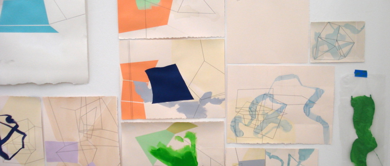
I used it alongside straight edged shapes, trying to figure out in what capacity it could fit into my work.  But didn’t feel really attached to the rough a scumbly edges.

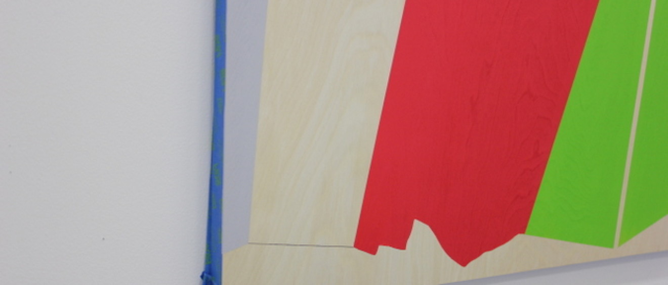
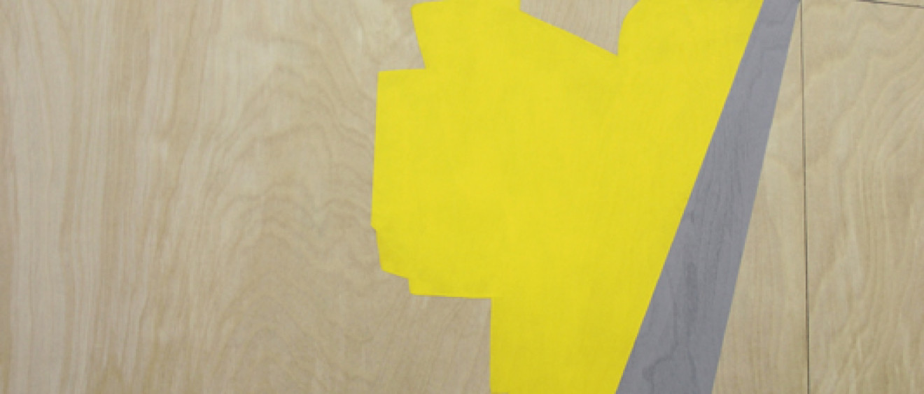
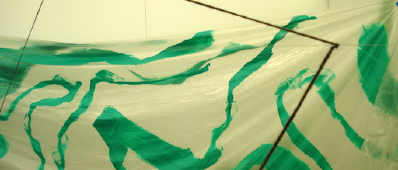
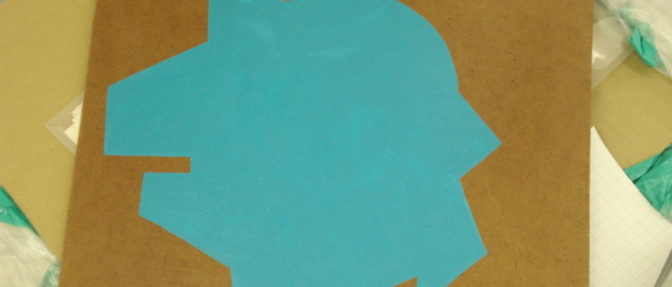
I started to fill in with a sharp edge the shapes the brush marks created.
Suddenly, these wonky shapes started appearing amongst the straight edged ones.

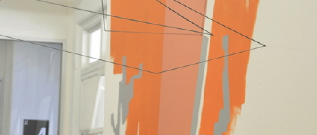
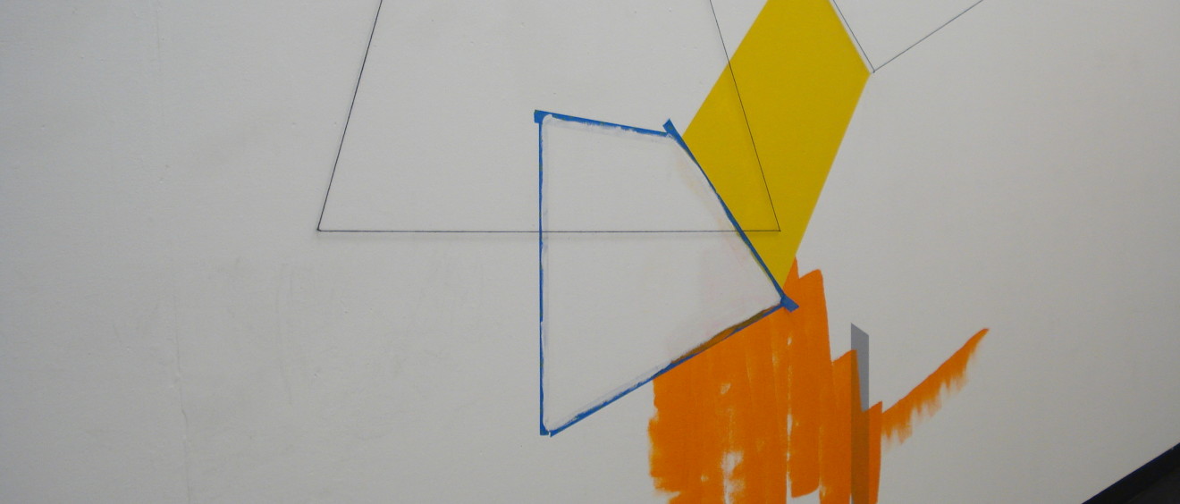
These were still random and deliberate shapes that were part of a line of unfolding architectural shapes (as above).  But I also started to play with the shapes as their own beast.

These are still tests.  I haven’t made any resolved works out of them, but they are good to have cooking along in the background.  I feel they still have a very strong relationship to architecture and space.  So I expect there will be more of these, perhaps in a wall installation capacity.

‘Is the tape part of the work?’

Grand plans, that’s what I had.  It was going to be the first of a series of works on wooden board and I already knew what I wanted to do.  But then came the suggestion ‘Is the tape part of the work?’
Gosh.  No.  It’s not…. wait.

Ah, the eyes of other people!  They see other things.  I had taped the edge of the wood to protect it while I was working with it.  However, as the tape is a vibrant blue, it played off the colours I was working with on the board.

(c) 2012 Naomi Nicholls, Is the tape part of the work? (detail view)
Acrylic and low-tack painters tape on wooden board

 
(c) 2012 Naomi Nicholls, Is the tape part of the work? (side view)
Acrylic and low-tack painters tape on wooden board

(c) 2012 Naomi Nicholls, Is the tape part of the work?
Acrylic and low-tack painters tape on wooden board

For the moment, it stays.  I think they were right.  It is part of the work.
Makes me giggle every time I see it though.

Analogous to Orange

(c) 2012 Naomi Nicholls, Analogous to Orange
Acrylic, vinyl and wool on wall.
(c) 2012 Naomi Nicholls, Analogous to Orange
Acrylic, vinyl and wool on wall/floor.
(c) 2012 Naomi Nicholls, Analogous to Orange
Acrylic, vinyl and wool on wall.
 (c) 2012 Naomi Nicholls, Analogous to Orange
Acrylic, vinyl and wool on wall.
 (c) 2012 Naomi Nicholls, Analogous to Orange
Acrylic, vinyl and wool on wall.
 
 (c) 2012 Naomi Nicholls, Analogous to Orange
Acrylic, vinyl and wool on wall.

Using a hierarchy of analogous colour and scale, this painting installation comes complete with a suggested order of reading.  The brushed yellow and grey line on the floor is the point of entry, start there.  Up, it beckons, to the illusory space on the left which suggest a kind of interior and draw attention to the light above.  Webs of wool shapes interrupt overhead space, joining left to right wall.  On the right a series of forms and illusory shapes have a closer relationship to the body moving through the space, being of a similar size to the body and closer that the afforementioned shapes.  Then an interruption to the rambling shapes and a leap to a single geometric form painted on the floor.

This work took quite some time for me to be satisfied with.  Every time I create a work, it’s a learning experience.  This has been no different.  I am pleased with the use of the architectural space of the hallway.  It’s an area I’m pretty familiar with and have made a couple of works here before, so I am no stranger to it.  The layout of the work in the space is kind of an outplaying of how my eye takes in the space when it’s empty.  I wanted to guide others through it as I see it.  As well as to use the dominant forms on the upper left to push people back against the opposite wall to influence the way people walked through the space.

An interesting development is that the elements which were painted on the floor were walked over, not stepped over or walked around.  I guess this is indicative of how one walks in an actual thoroughfare – this is not technically an art space, so people continue to barrel through as usual.  Something I could consider for future works – do I want to do something to interrupt their normal barrelling through spaces, or allow their walking over the work to change it?

Mixing Colours – Works on Board

(c) 2012, Naomi Nicholls
Acrylic and graphite on board

Check out these new works on plywood board, a fantastic substrate to work on.  I found a supplier of them and I am slowly whittling down their supply.  It is raw 3-ply on a braced frame, somewhat like the stretchers of a canvas.  This return to a more traditional substrate hails a return to artist quality acrylics, which means, I can mix colours once more.  When working on walls with house paint, I had to make colour decisions at the hardware store – because of the high content of filler and low pigment in house paint, they don’t mix well and end up muddy horrible colours.  Artist acrylics have a high amount of pigment in them, which means they mix like a dream.  Now I make colour decisions sitting in front of my easel.

The works feature abstract architectural space and painterly, flat fields of colour in contrast.

 (c) 2012, Naomi Nicholls
Acrylic and graphite on board
 
 (c) 2012, Naomi Nicholls
Acrylic and graphite on board

Analogous and a Work in Progress

An installation of analogous colours has been forming in the hallway of late.  The hallway I have used before.   Analogous is a nice word, yes?  Analogous colours are colours that are adjacent to each other on the color wheel, as opposed to complementary colours, which are opposites on the colour wheel. Ah, an education.

It is almost all the way done.  Photos and more details of the finished product coming next week…

Have an analogous day, everybody.

Painting Experiment 1 – Video

The creative process has been a bit harrowing of late.  Do you know the feeling?
Many experiments have followed, and out of frustration I made a video piece that I starred in.  Some people do that when they’re frustrated, I guess?  That’s something you won’t catch me doing very often.  Yet here I am, painting into thin air from the inside out.
(c) 2012 Naomi Nicholls, Painting Experiment 1
Video (Still 1)
(c) 2012 Naomi Nicholls, Painting Experiment 1
Video (Still 2)
It was pretty fun to make.  I didn’t get too much paint on myself, and it helped me to learn what I don’t want to do, make works about me.  There, I said it.  Shall we move on then?
This painting onto plastic thing I have been playing with in recent weeks has been pretty fun.  Unfortunately, it also caused a bit of a distraction from the work I want to be making.  In many ways, I’m not much of a multi-tasker with ideas.  I can’t move my work in two disparate directions, they have to vaguely be going toward the same end.

The paint carnage afterward wasn’t actually that bad…

In Air – Further Experiments

Sometimes ideas come thick and fast.  Sometimes art is slogging it out in trial and error.
It’s all a bit ‘sloggy’ at present.

I now have a brush which is 100mm wide.  I couldn’t believe how much difference it makes to the type of stroke it produces.  Instead of looking a bit contrived, as I felt they were in my investigation with the contact, they look like normal and free flowing gestures.  A marvellous development.

This is actually on a house painting drop sheet.   I need to research other materials.  This is quite a floppy material.  I’d like to push the material further and see what can be done.

Returning to the studio after a few weeks off was nice.  I had the whole studio to myself and cleared away some earlier work, before hanging up the plastic sheet that I painting at home.  I just needed it to be in my line of sight to see where it could go.

Putting whatever I’m working on in my line of sight helps so much to keep the mind ticking over on what comes next.  This sheet could go in a bunch of different directions.  I like how it is transparent and layering is a possibility.  As is projection and lighting.

What I started doing today was thinking about creating an installation based upon my Collage Paintings, particularly those with the gestural brushstrokes.  Oh to defy gravity in painting!  Sadly, it can’t be done – except through illusion, so illusion it shall be!  I am rigging up some fishing line to form the structure/support to ‘draw’ upon with wool.  With which I can create floating shapes of wool without wall anchor points, just like the ruled graphite lines in the Collage Paintings.

In considering how I can defy gravity with the brushstrokes themselves, I have cut around a brushstroke from the plastic sheeting, creating something similar to a paint skin.  It’s not very structurally rigid, which makes for a floppy brushstroke, but there still may be something to suspending it with fish line, as seen below.  Structurally sound brushstroke anyone?

Collage Paintings

During the past few months, I have been making what I think of as collage paintings.  I start with a large sheet of watercolour paper and tear them to the size and then pile them up.  Then I start working on 4 or 5 at once, mainly due to drying times.  I paint a background which is like walls of a room going back to a vanishing point. To that I add shapes that respond to the small interior space.  You can also see how these have been the impetus for some of my installations, colours, shapes, forms.  I go back and forth between these drawings and the wall.

I have been putting them up on the wall (as pictured) and would love to make an large installation of them, perhaps filling a room.  Where the development and sketches become the work as a big grouping.  Something to play with over the coming months.

The works are graphite, acrylic and watercolour on paper.

In Air – work in progress

Recently, I was talking about painting into thin air.  A romantic notion, no?

I wanted to try looping and squiggling my way across the walls of this hallway and across corners and into space using clear vinyl.  Wouldn’t that be swell?  So I started.  But as so often happens, it didn’t quite go according to plan.

There’s this weird thing that happens when you’re an artist working in painting/installation.  You learn things you never thought anyone would need to know.  Like, I know that acrylic house paint doesn’t crack, peel or bead when painted on clear contact, but artist acrylic does.  And I know that painting wool is a rotten job and requires an undercoat to work.

On this work, I am learning that it’s hard to make your squiggle look intuitive when you’re painting a wide and looooooong brushstroke with a comparatively small brush.  Now, perhaps that’s something I should have anticipated.  I didn’t.  I’ma get me a bigger brush!  For starters.  Then I will see where this goes.  There’s much more to do on this.

Also, will I add geometric shapes to this, or simply let it be a big brushstroke?  The suspense is killing me.

Orange Bounce


(C) 2012 Naomi Nicholls, Orange Bounce (Installation view)
Acrylic, vinyl, graphite

 (C) 2012 Naomi Nicholls, Orange Bounce (Installation view)
Acrylic, vinyl, graphite
 (C) 2012 Naomi Nicholls, Orange Bounce (Installation view)
Acrylic, vinyl, graphite
(C) 2012 Naomi Nicholls, Orange Bounce (Installation view)
Acrylic, vinyl, graphite
 (C) 2012 Naomi Nicholls, Orange Bounce (Installation view)
Acrylic, vinyl, graphite
 (C) 2012 Naomi Nicholls, Orange Bounce (Installation view)
Acrylic, vinyl, graphite


A little catch up post of work from a couple of weeks ago.

This new hallway work (new work, new hallway) comprises of a large area of orange, it’s more British Paints Peachy Dream actually.  The shape casts from the floor up onto the wall and across the open door, as if it were a projection of light.  Incidentally, I should work with projection.  There’s an idea!  The shape sits on a background area of washy and painterly grey watercolour, which make the shape seem as if it’s floating.  Further along the wall is a muted green, which floats a meter off floor level and also sits on a watercolour background.  Painterly marks in watercolour and green appear on the opposing wall and also on the floor where the orange shape sits.  Overlaid the large orange shape is part of a grid in vinyl and a set of three geometric shapes butted up against each other and stretching down onto the floor.

The work has a strong directional property, a hierarchy of where to look.  The orange is obviously the starting point and your sight bounces from one point to the next.  There is also a great effect on the opposite wall to the orange shape – an orange glow.  My photographs don’t quite capture it, but it’s striking to walk through.

The experiential nature of my work needs some exploring.  For me, they relate heavily to the body.  Although you wouldn’t think so, to look at them.  But when one walks through, ones body is directed by the work, as is one’s eyes and head.  Where do I bounce from?  Do I duck under anything?  I also feel aware of my height and size in relation to the work.  Sometimes the scale of my work in relation to the body prompts the viewer to step away to capture it all in one line of sight.  This has been really interesting when making work in hallways.  I also think the hallway aspect has really added to the content of the body in my work.  For example Other Points of View was in a square room, and not a thoroughfare.  It did have some good readings, and others did read a bodily interaction with the work.  But nowhere near as much as it has ‘worked’ in hallways.  And even in Line Drawing Extrusion from my Dimensions of Space exhibition, the room was long and narrow, and there was a reason for the viewer to walk the length of it.  That wasn’t present in Other Points of View.  So – certainly something to play with.