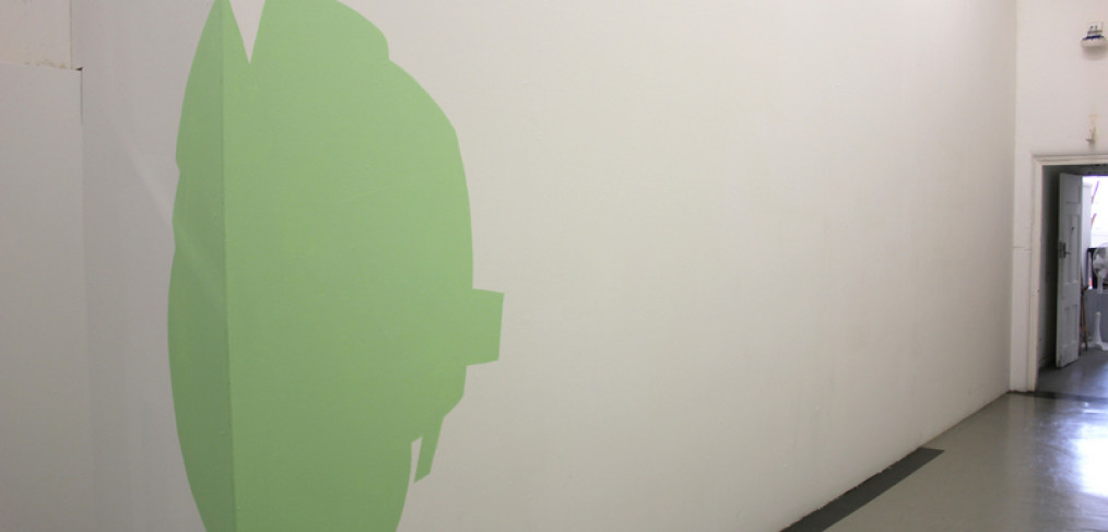
(c) 2012 Naomi Nicholls, Analogous to Orange
Acrylic, vinyl and wool on wall.
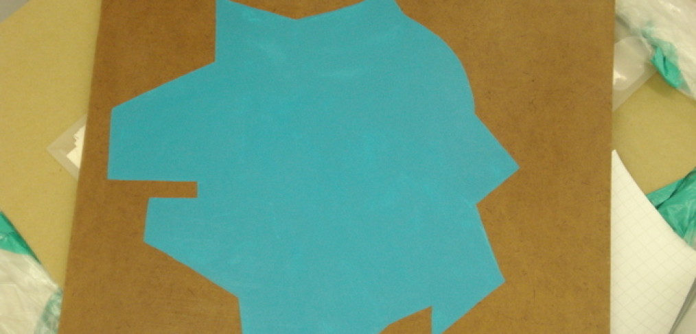
(c) 2012 Naomi Nicholls, Analogous to Orange
Acrylic, vinyl and wool on wall/floor.
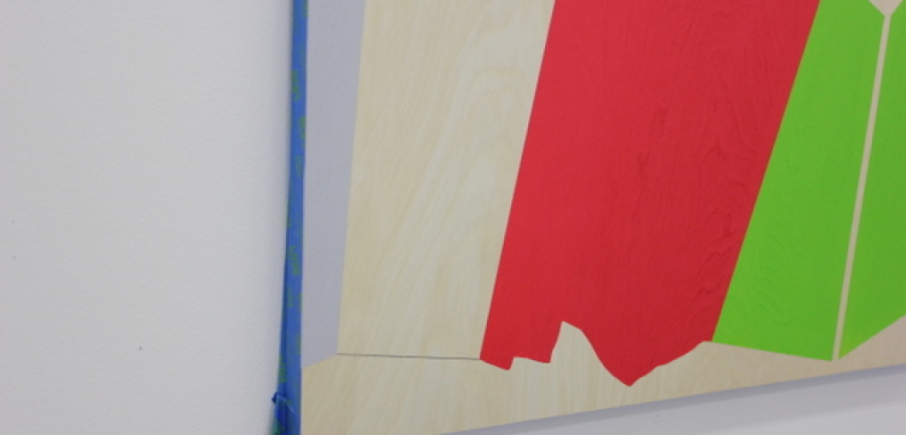
(c) 2012 Naomi Nicholls, Analogous to Orange
Acrylic, vinyl and wool on wall.
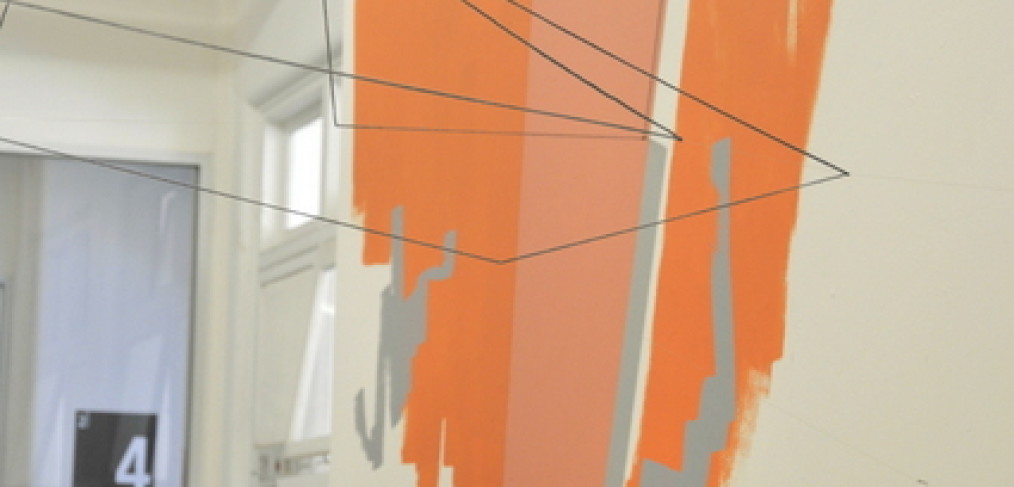
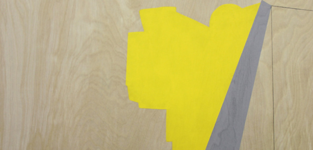
(c) 2012 Naomi Nicholls, Analogous to Orange
Acrylic, vinyl and wool on wall.
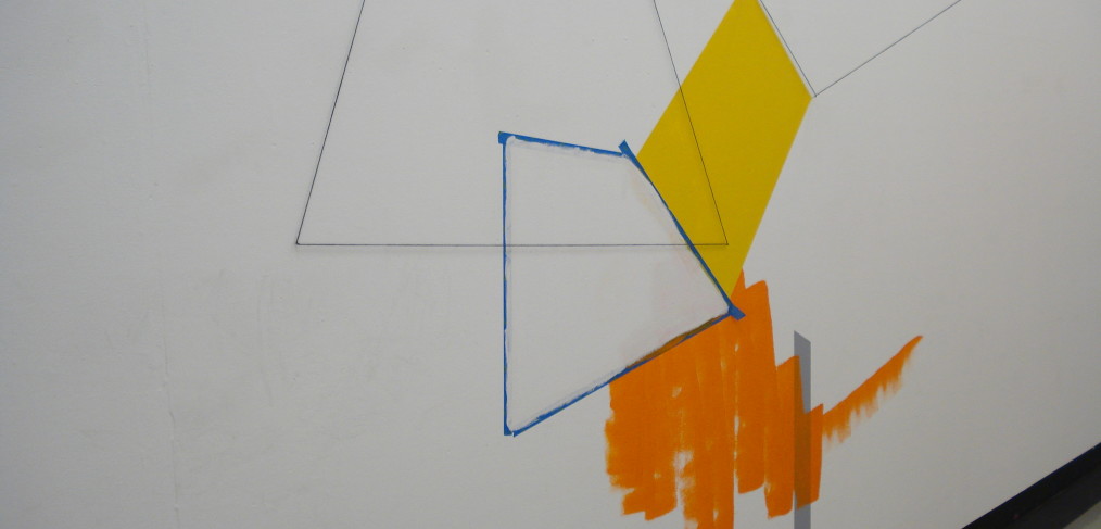
(c) 2012 Naomi Nicholls, Analogous to Orange
Acrylic, vinyl and wool on wall.
(c) 2012 Naomi Nicholls, Analogous to Orange
Acrylic, vinyl and wool on wall.
Using a hierarchy of analogous colour and scale, this painting installation comes complete with a suggested order of reading. The brushed yellow and grey line on the floor is the point of entry, start there. Up, it beckons, to the illusory space on the left which suggest a kind of interior and draw attention to the light above. Webs of wool shapes interrupt overhead space, joining left to right wall. On the right a series of forms and illusory shapes have a closer relationship to the body moving through the space, being of a similar size to the body and closer that the afforementioned shapes. Then an interruption to the rambling shapes and a leap to a single geometric form painted on the floor.
This work took quite some time for me to be satisfied with. Every time I create a work, it’s a learning experience. This has been no different. I am pleased with the use of the architectural space of the hallway. It’s an area I’m pretty familiar with and have made a couple of works here before, so I am no stranger to it. The layout of the work in the space is kind of an outplaying of how my eye takes in the space when it’s empty. I wanted to guide others through it as I see it. As well as to use the dominant forms on the upper left to push people back against the opposite wall to influence the way people walked through the space.
An interesting development is that the elements which were painted on the floor were walked over, not stepped over or walked around. I guess this is indicative of how one walks in an actual thoroughfare – this is not technically an art space, so people continue to barrel through as usual. Something I could consider for future works – do I want to do something to interrupt their normal barrelling through spaces, or allow their walking over the work to change it?