Paint and Vinyl, Together Again

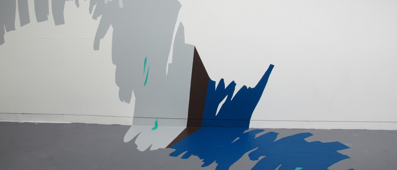
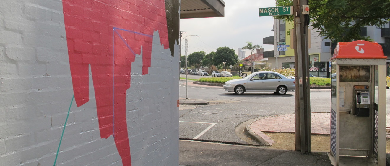
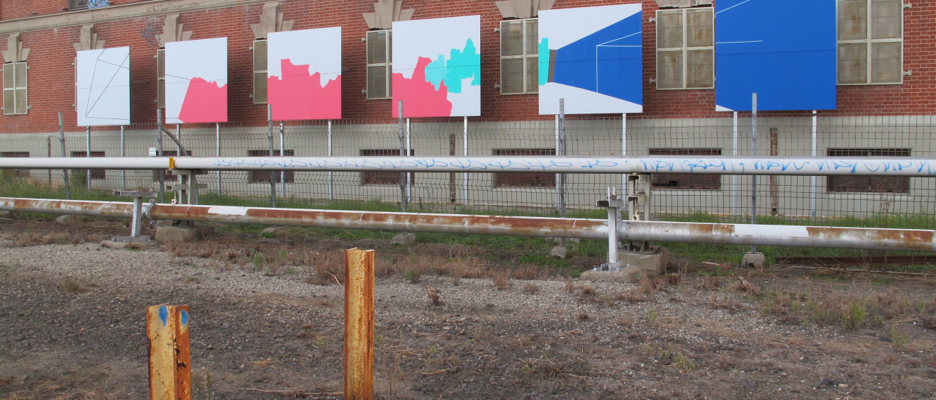
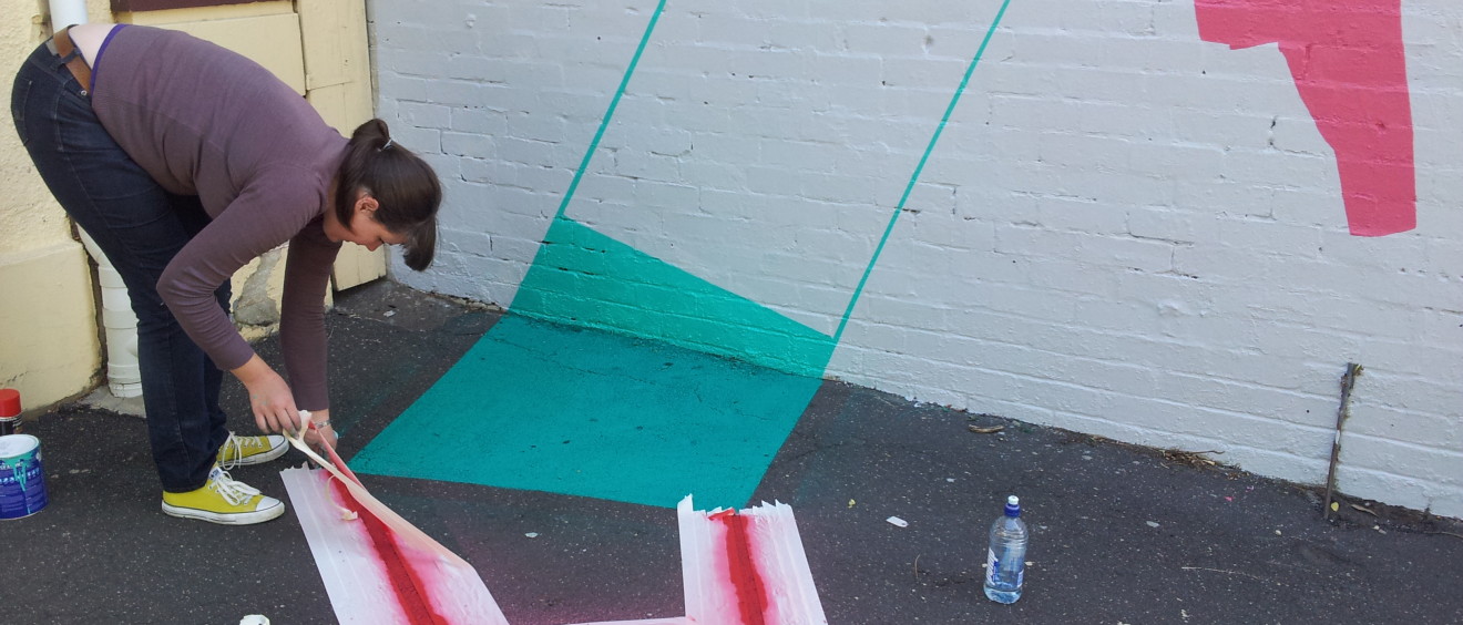
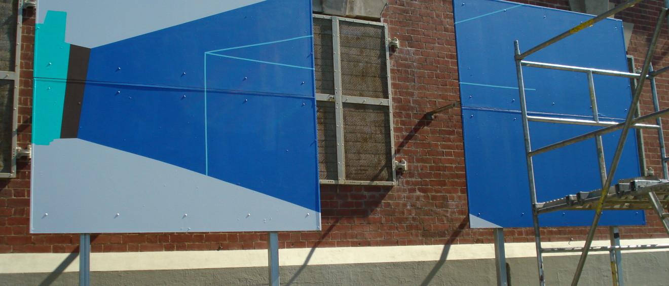
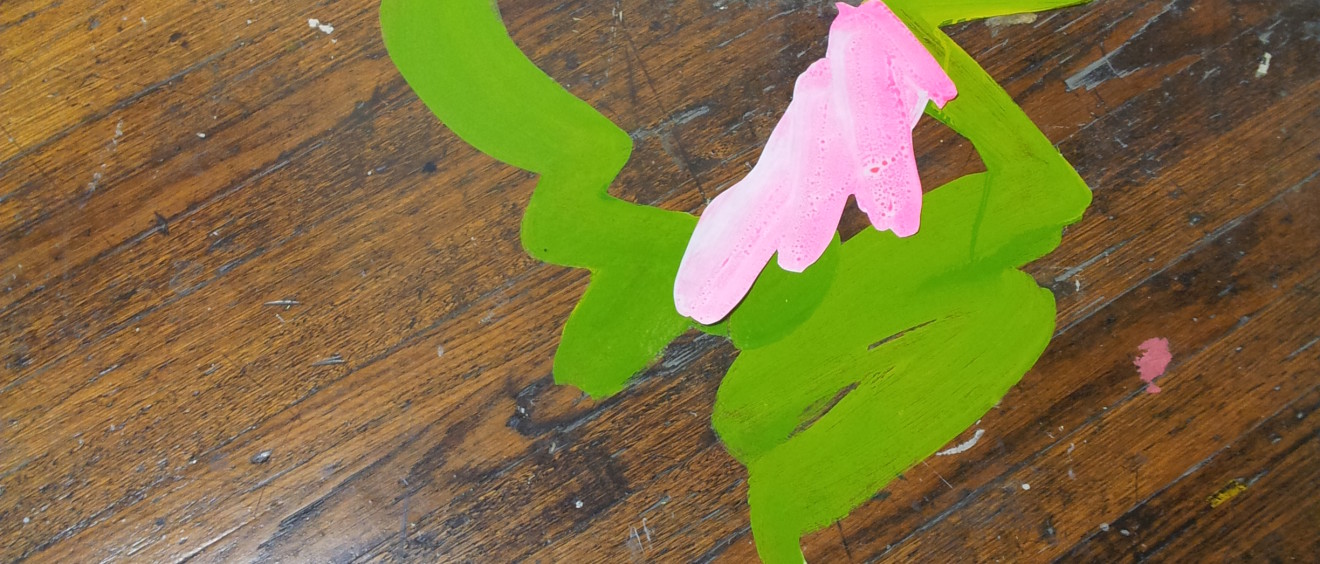
“Painting onto vinyl. Yes, that’s what I’m doing.” She utters inwardly, in relief!

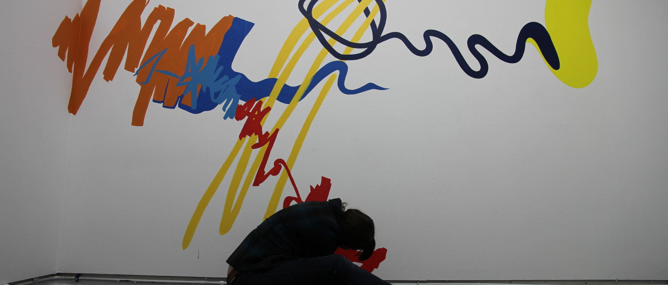
Something about the middle of the year sends me for a bit of a tailspin in my practice. I’m not sure if it’s just a coincidence or something else. But at the middle or briefly after the middle of the year, I am in struggle town – that’s the way it has been for the past few years. This year, I think it’s because I have been deconstructing what I do, peeling back layers and layers and questioning everything, reducing reducing… That’s all reportedly what you do in an Honours year. Huzzah. I am having a great time learning so much here, but I am also rebuilding. Perhaps only just days ago turning the corner and starting to build instead of continuing the deconstruction of my ideas and marks and ways of working. So many metaphors. So so many metaphors. Perhaps with a dash of ‘hang in there kitty’.

Read More
Cornered Gesture (c) 2013 Naomi Nicholls

Cornered Gesture

In this work from a few weeks ago, I placed myself into the corner of the room and gestured around corners.  Down wall and onto the floor in one movement, that was the plan.  I was also attempting to open up my marks and start to use vary the thickness of the brush and begin to layer.  I have still used some straight-edged shapes/lines in an effort to stay connected to my previous ideas, however slowly they are receding – they appear less and less and take a less dominant role.

The colours were very flat, except for the little suggestions of aqua, which were transparent and painterly.  At first that was not my plan, but I liked the effect when I first applied the paint and it didn’t have the same coverage as the other colours.

Read More

Installing – Interchange: We’re Afraid of Red, Yellow and Blue at Seventh ARI

We’re Afraid of Red, Yellow and Blue is a collaborative project Polly Hollyoak and myself have been planning for a few months now.  We knew we wanted to paint and installation together and formulated a plan – a game if you like, a set of constraints to follow, with which we would make our installation.  We were given the rear gallery at Seventh ARI on Gertrude Street and when the day came, we got stuck into it.

Constraints
Three colours, primary – red, yellow and blue.  And lighter and/or darker versions of those.One person was to start with one colour, and begin painting.
Then the next person would choose a different colour and respond to the previous iteration.

Read More

Legal Tagging and the Body Signature

Recently, I discovered a local ‘Urban Art Supplier’, a phrase I had never actually contemplated.  How very closed minded of me.  Yet, it is true.  The establishment, with a secure entrance (they have to buzz you in), feels like a dungeon, but of the delightful kind if it’s possible.  Every wall is floor to ceiling colours of spray paint, in brands I have largely never seen before, and colours of many different shades.  It’s not just pink – oh no – it’s baby pink, light pink, dark pink, fluoro pink, pearlescent pink, metallic pink, plus those options in every other colour too.  I do love that about art stores in general.

In addition, there were paint pens/textas in many colours and thicknesses.  Some really thick, diabolically thick actually, ink pens.  I had often seen tagging around and wondered what they’d used.  I then discovered a new tool.  A mop.

Read More

Linked Internal Space II

Now I can share with you the other work I made for Art in Public Places, named Linked Internal Space II.  It is a further iteration of Linked Internal Space I, at the Substation Transit Gallery.  This link to the transit gallery billboards is done through repeated imagined constructed architectural shapes, which spill from the wall to the asphalt below.

Read More

Art in Public Places on Mason Street

Ah public art.  Everyone has an opinion, and I have inserted myself into that scene with eyes somewhat open, knowing what I might find there, but hopeful that the experience would be overall good.

Linked Internal Space II, another of my works which is part of Art in Public Places, is situated on a fairly main thoroughfare for parents with kids on their way to the park, commuters on their way to the train station and those out for a little local shopping.  Another artwork for a previous project had occupied the wall up until a week or two before I installed – underneath was blank coffee-coloured brick wall with black graffiti tags spray painted all over.  My first job was to paint the bricks grey, my desired background colour.  Most passers-by seemed to think I was just painting out the graffiti – what a good citizen.  Sorry ladies and gentlemen, I had ulterior motives.

Read More